

How to Build a Shopify Cart That Increases AOV and Conversion Rate.
Most Shopify brands treat the cart as a simple order summary: a list of items, a subtotal, and a checkout button. But the cart is the one place where a shopper has already decided to buy and is still open to a nudge. That makes it one of the highest-leverage spots in your store.
A strategically designed Shopify cart drawer can increase average order value, unlock additional purchases, reinforce your offers, and reduce last-second hesitation, all without sending anyone to a new page.
The approach we recommend has four parts:
- Set the right progress bar thresholds
- Make upsells dynamic, not generic
- Reinforce the reward once it’s unlocked
- Don’t underestimate payment and trust signals
Let’s walk through each one, then put them together into a single cart flow.
1. Start With the Right Progress Bar Thresholds
A progress bar (“You’re $18 away from free shipping”) is one of the most common cart features in Shopify AOV optimization. It’s also one of the most commonly misconfigured, because the threshold is usually picked at random: $50, $75, $100, whatever feels round.
Use your AOV to set the threshold
Start with your current average order value. A good starting point for a Shopify free shipping threshold is a figure meaningfully above your AOV, but close enough that the gap feels easy to close with one more item. If your AOV is $42, a $50 or $55 threshold is within reach. A $120 threshold is not; shoppers will ignore it.
Also look at your order value distribution, not just the average. If a large share of orders already land just under a candidate threshold, that’s a sign it could move many customers with a small add-on.
Make the next reward feel attainable
The goal isn’t to make customers spend as much as possible. It’s to make the next purchase feel worthwhile and attainable. A shopper who is $8 away from a reward will often add a small item. A shopper who is $60 away will usually just check out as they are.
Free shipping vs. free gifts
Both work, but they behave differently:
- Free shipping removes a cost that many shoppers resent. It’s familiar and works well when shipping is a real objection for your customers.
- Free gifts add perceived value and can feel more exciting, especially if the gift is something customers would genuinely want. They’re also useful when you want to protect margin on shipping or push a specific product.
Which one wins depends on your products, margins, and audience, which is why this is worth testing.
Consider tiered rewards
Tiers can stretch customers further without making the first goal feel out of reach. For example: free shipping at one level, a free gift at a higher one. The first reward gets people moving; the second rewards those who keep going. Keep it to two or three tiers at most, or the progress bar becomes noise.
Test your thresholds
Treat your first threshold as a hypothesis. Try a few levels and compare AOV, conversion rate, and the share of orders that reach the reward. A threshold that raises AOV but drops conversion may not be a net win.
2. Make Upsells Dynamic, Not Generic
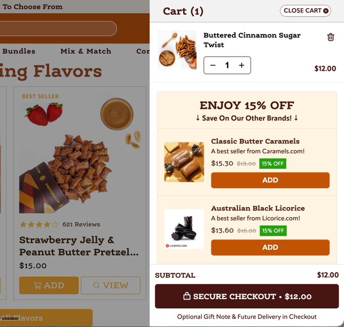
If every shopper sees the same “You may also like” products regardless of what’s in their cart, you’re leaving the strongest part of the cart unused. Generic recommendations get ignored because they don’t feel connected to what the customer is buying.
Cart-based recommendations
Effective Shopify cart upsells respond to what’s actually in the cart. Someone buying a coffee grinder should see filters, beans, or a cleaning brush. Someone buying a moisturizer should see a cleanser or SPF, not a random bestseller.
What makes a good cart upsell
- Complementary products: items that naturally go with what’s in the cart.
- Lower-priced add-ons: the cart is not the place to pitch a product that costs more than the whole order. Small, easy yeses perform best.
- Threshold-fillers: products priced to close the gap on the progress bar. If the customer is $14 from free shipping, show items near or just above that amount.
Here’s a simple formula to keep in mind:
Relevant + Affordable + Threshold-Filling = Strong Cart Upsell
An upsell that hits all three feels helpful rather than pushy, because it solves the customer’s “I’m almost at the reward” problem with something they might actually want.
How to power it: metafields and purchase data
There are two practical ways to build these relationships:
- Shopify metafields: you can store manually curated relationships on each product (for example, a list of complementary products), then have your cart pull from them. This gives you control and works well for smaller catalogs.
- Purchase data: look at which products are frequently bought together in your order history. These patterns often surface pairings you wouldn’t have guessed, and they scale better as your catalog grows.
Many stores combine both: data to discover relationships, metafields to apply and refine them.
3. Reinforce the Reward Once It’s Unlocked
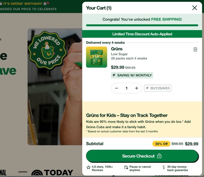
Most stores stop at showing progress. But when a customer actually crosses the threshold, that’s a moment worth acknowledging. If nothing visibly changes, the shopper may not even notice they’ve earned something.
Make the unlock obvious:
- Change the progress bar message from “$18 away from free shipping” to “🎉 Free shipping unlocked ✓”
- Display “You’ve unlocked your free gift” in the cart
- Show the free gift as a $0 line item, so it feels real and tangible, not abstract
The psychology of confirmation
Reward confirmation does two things. First, it gives the customer a small sense of accomplishment, which makes the purchase feel like a win. Second, it reduces the chance they remove an item afterward, because doing so would mean losing something they now feel they own. Seeing the gift sitting in the cart as a $0 item makes it feel earned rather than promised.
It also builds trust: the customer sees the offer being honored in real time, before they ever reach checkout.
4. Don’t Underestimate Payment and Trust Signals
Payment icons are often treated as decoration. They’re more useful than that. Near the checkout button, they quietly answer a question shoppers are already asking: can I pay the way I want to, and is this safe?
Best practices
- Show the payment methods your customers actually use. If a large share of your orders come through Shop Pay, Apple Pay, or PayPal, make sure those are visible.
- Avoid unnecessary logos. A long row of icons for methods you barely see adds clutter and weakens the ones that matter.
- Check mobile visibility. Many cart drawers look fine on desktop but push payment icons below the fold on a phone. Make sure they show without extra scrolling.
- Place them near the checkout CTA. Trust signals work best at the moment of commitment, right next to the button.
- Keep trust signals light. A short line about secure checkout or easy returns can help, but stacking multiple badges, banners, and guarantees will crowd out the elements that drive AOV.
The cart has limited space. Every element should earn its spot.
5. The Ideal Cart Flow
Put the four parts together and the cart follows a clear path:
Customer adds a product → sees progress toward a reward → gets a relevant upsell → reaches the threshold → sees the reward visibly unlocked → checks out.
Here’s how each element supports that flow in the cart drawer:
- Top of the cart: the progress bar, so the goal is the first thing the shopper sees.
- Cart items: the product(s) they’ve added, with clear quantities and easy editing.
- Upsell section: two or three relevant, affordable products that help close the gap.
- Reward state: once the threshold is reached, the bar updates and any free gift appears as a $0 item.
- Checkout area: subtotal, a clear CTA, and payment icons sitting right beneath it.
(Insert your cart mockup here and annotate each of the five areas above.)
Notice what’s missing: clutter. The best carts feel simple because each element has one job and they all point toward the same action.
6. The Real Secret: Test Everything
There’s no universal “perfect” cart. What works for a skincare brand with a $45 AOV may fail for a furniture store with a $400 AOV. The real advantage comes from testing and iterating.
Things worth testing:
- Threshold amounts
- Free shipping vs. free gift
- Upsell products (which ones, and how many)
- Upsell positioning (above or below the items)
- Progress bar messaging (“You’re $12 away” vs. “Add $12 for free shipping”)
- Gift values and which gift you offer
- Payment icons (which ones, and where)
- CTA copy (“Checkout” vs. “Secure Checkout” vs. something more specific)
Change one variable at a time, run each test long enough to get reliable results, and judge success on more than AOV alone. Watch conversion rate and revenue per visitor too, since a change that lifts AOV but loses orders isn’t an improvement.
Conclusion
Your cart shouldn’t just tell customers what they’re buying. It should give them a reason to buy a little more.
The best-performing carts look simple because the complexity happens behind the scenes: data, product relationships, well-chosen thresholds, thoughtful incentives, and continuous testing. Get those right, and your cart stops being a checkout step and starts working as a revenue engine.
SEO notes
- Primary keyword: Shopify cart optimization
- Secondary keywords: Shopify cart drawer, Shopify AOV optimization, Shopify upsells, increase Shopify average order value, Shopify conversion rate optimization, Shopify cart upsell, Shopify free shipping threshold, Shopify cart design
- Suggested internal links: a post on free shipping strategy, a post on product bundling, and your cart or upsell app page
- Alt title options: How to Build a Shopify Cart That Increases AOV and Conversion Rate or The Anatomy of a High-Converting Shopify Cart
Leave a Reply