

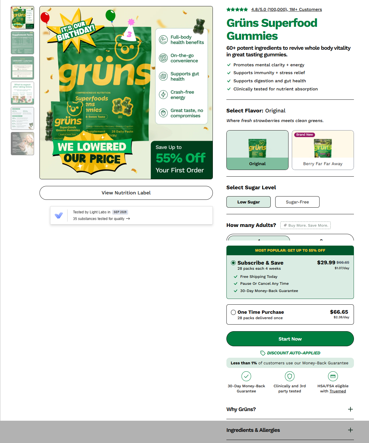
Discover some of the common CRO bottlenecks on ecommerce product pages and how to fix them.
If your ecommerce store is converting below 3%, the problem is rarely traffic quality — it’s usually the product page itself quietly leaking buyers at every scroll. Here are seven fixes that consistently move the needle, based on patterns seen across dozens of high-performing DTC stores.
1. Give the Product a Name That Does the Work
A product title like “Relaxation Tea” tells a shopper almost nothing they can act on. Which flavor? What quantity? Is this a trial size or a bulk buy?
Compare that to “Relaxation Tea – Mixed Berry, Pack of 12.” Same product, same page — but now the title alone answers three decisions the shopper would otherwise have to dig for. On mobile especially, where people skim rather than read, your title is doing 80% of the “is this what I want” work before they even look at the price.
Fix: Bake variant, flavor, and quantity into the title itself. Don’t make people open a dropdown to find out what they’re even looking at.
2. Replace Brand-Story Paragraphs With Bullets
Founders love to tell the origin story on the PDP — why the company exists, what it stands for, the journey. That’s great content, but the product page is the worst place for it. A dense paragraph in the middle of a buying decision reads as friction, not persuasion.
The fix isn’t to delete the story — it’s to relocate it (About page, brand page) and replace it on the PDP with a tight, scannable bullet list: tasting notes, key specs, standout attributes. A shopper deciding whether to buy coffee needs “smooth buttery finish, medium roast, USA roasted” in half a second — not a paragraph about liberty and unity that happens to mention the roast profile in sentence four.
Fix: One short tagline sentence, then bullets. Save the narrative for content that isn’t standing between a shopper and “Add to Cart.”
3. Use Your Image Gallery to Teach, Not Just Show
Most PDPs treat the image carousel as a formality — five angles of the same product on a white background. That’s a wasted opportunity. Each image is a chance to answer an objection or reinforce a benefit before the shopper has to scroll down and read for it.
A stat overlaid directly on a product photo (“96% said skin looks and feels smooth”) gets absorbed in the half-second a shopper spends swiping through images — far faster than the same claim sitting in a paragraph they might skip. Ingredient breakdowns, usage diagrams, and before/after shots all work the same way: they turn passive scrolling into passive education.
Fix: Treat your gallery like a mini pitch deck. Each image should either build desire or answer a question — not just show another angle.
4. Move Your Real Benefits Above the Fold
Generic navigation elements — category links, a “10% military discount” banner most visitors don’t qualify for — take up prime real estate that should be doing conversion work. The moment someone lands on a product page, they should immediately see: what it is, why it’s good, what people think of it, and what it costs.
Pushing reviews, price, and the core value proposition higher — ahead of generic promo banners — shortens the distance between landing and deciding. Every extra scroll before the shopper sees “4.6 stars, 201 reviews, $8.99” is a chance for them to bounce.
Fix: Audit what’s above the fold. If it’s not helping someone decide to buy, it shouldn’t be first.
5. Don’t Leave Dead Space Next to Add to Cart
The area immediately surrounding your Add to Cart button is some of the highest-attention real estate on the entire page — and most stores waste it on empty space or a generic quantity selector.
Adding trust signals here (free shipping, a free-sample threshold) or a single strong review snippet right beside the button reduces last-second hesitation exactly when it matters most. This is the moment shoppers are asking “is this really worth it” — and it’s the cheapest place on the page to answer that question with proof.
Fix: Surround your CTA with reassurance, not silence.
6. Kill the Horizontal Tabs
Tabbed sections (“What It Is / What It Does / Notes / Ingredients”) feel organized in a design file, but in practice they hide 75% of your content behind clicks most shoppers never make. Worse, on mobile, horizontally scrolling tab labels get cut off and become genuinely hard to navigate.
Switching to a stacked accordion — sections that expand downward instead of sitting in hidden tabs — keeps everything visible and scannable in one vertical flow. Shoppers can see that more information exists (ingredients, how-to-use, FAQs) without needing to guess which tab to click.
Fix: Accordion, not tabs. Let people scroll instead of forcing them to click their way to information they may not know they need.
7. Give the Shopper a Small, Unexpected Delight
The final add-to-cart action doesn’t have to be purely transactional. Adding a small reward at the moment of commitment — like letting the shopper choose a free sample to include — turns a flat “add to bag” click into a small moment of positive surprise.
This matters more than it sounds. Purchase decisions are emotional as much as rational, and a tiny moment of “oh, that’s a nice touch” right before checkout does real work on both conversion and repeat-purchase intent — people remember brands that made buying feel good, not just efficient.
Fix: Look for one low-cost moment near checkout where you can add delight instead of just confirming a transaction.
The underlying point: none of this happens by accident. A website doesn’t convert well just because the product is good — conversion rate is something you deliberately design for, page element by page element. Fix these seven areas and you’re not just improving a page, you’re directly moving revenue.
Leave a Reply