

Discover 8 best-converting landing page formats!
Every performance marketer eventually hits the same wall: the audience is dialed in, the creative is doing its job pulling in clicks — and then the landing page kills the conversion anyway. The format the click lands on matters as much as the ad that generated it. In WooCommerce specifically, most stores never get past a default product page, which is why so much ad spend evaporates on the last ten feet of the funnel.
Below is a detailed breakdown of eight formats currently outperforming generic product pages, pulled from real examples across health, wellness, pet, and consumer categories — what makes each one work psychologically, where it fits in the funnel, what to watch out for, and how it maps onto a WordPress/WooCommerce build.
1. Advertorials — the “must-have” format
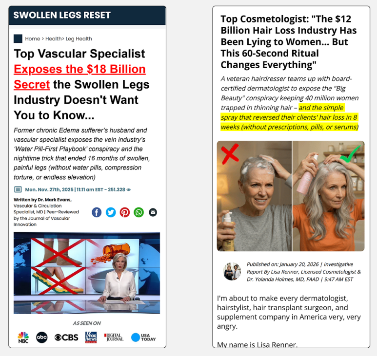
An advertorial disguises itself as editorial content rather than a sales pitch: a news-style masthead, a byline from a credentialed-sounding expert, “as seen on” media logos, a publish timestamp, social share icons sitting where you’d expect them on a real article. The examples pulled here use a “vascular specialist exposing an industry secret” framing and a “cosmetologist exposing the hair-loss industry” framing — both borrowing the visual grammar of investigative journalism rather than advertising.
Why it converts: People have built up heavy ad-blindness — banner blindness has evolved into a general distrust of anything that visually announces itself as promotional. An advertorial slips past that filter because it doesn’t pattern-match to “ad” on first glance, so it earns the benefit of the doubt a straight sales page never gets. The “industry conspiracy” angle does double duty on top of that: it pre-answers the reader’s skepticism (“why haven’t I heard this before?”) before they even have the chance to ask it, converting a potential objection into part of the hook.
Where it breaks: Ad platforms increasingly flag advertorials that impersonate news outlets, and the “expose the industry” framing is a well that’s being drawn from constantly — it’s heading toward its own kind of ad-blindness as readers get more pattern-savvy. Authenticity of the credential shown matters enormously: if the “Dr.” or “specialist” reads as fabricated, or the media logos are unlicensed, trust doesn’t just fail to build — it actively collapses and drags the whole campaign down with it, sometimes along with the platform account running the ads.
Build note: This is structurally just a styled blog post — a custom page template with a masthead header, author bio block, and inline CTA buttons woven into the copy rather than one at the bottom. It doesn’t need e-commerce logic at all until the final click-through, which makes it one of the cheapest formats to stand up.
2. Quiz Funnels
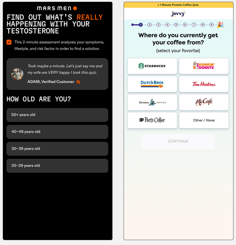
Instead of one static page, the visitor answers a short sequence of questions — age, symptoms, current habits, preferences — before ever seeing the offer. The testosterone-assessment and coffee-preference examples both use the same underlying structure: a visible progress bar, one question per screen, low-commitment questions first (age brackets, simple preferences) before anything more personal gets asked.
Why it converts: Each answered question is a small behavioral commitment, and people are measurably more likely to follow through on something they’ve already invested a few taps into — this is sunk-cost momentum working in the marketer’s favor rather than against the visitor. The sequential reveal also creates a Zeigarnik effect: an unfinished sequence nags at attention until it’s completed. And critically, a quiz lets you personalize the offer shown at the end based on the actual answers given, which reframes the sales pitch as a diagnosis — “here’s what’s right for you” lands very differently than “here’s what we’re selling.”
Where it fits: Best suited to categories where personalization is genuinely plausible and the questions feel like they’re doing real work — health, skincare, nutrition, fitness, anything with meaningful variation between customer types. It feels manipulative fast in categories where the quiz obviously can’t change the outcome (if every answer path leads to the identical product recommendation, visitors clock that quickly and trust drops).
Build note: This is the heaviest lift of the eight to build from scratch — it needs branching logic, state that persists across steps, and a way to map answer combinations to specific offers or copy variants. It’s exactly the kind of module that benefits from a purpose-built Steps Engine rather than being hand-rolled per campaign.
3. DR (Direct Response) Landing Pages
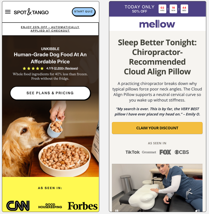
The classic single-scroll sales page: a strong benefit-driven headline, hero product shot, review count and star rating placed high on the page, one clear CTA repeated at logical intervals, trust badges from media placements. The dog food and pillow examples both follow this exact pattern — stripped navigation, no detours, one path forward from top to bottom.
Why it converts: It’s the most “get out of my way and let me buy” format that exists. For a visitor who already arrived with high intent — someone clicking a retargeting ad, or someone who’s already seen the brand once — friction is the enemy, not persuasion. This format has almost none: no quiz to complete, no article to read through, just the case for the product and a button.
Where it fits: Best matched to bottom-of-funnel and warm traffic. Cold traffic — someone who’s never heard of the brand — tends to need more narrative or trust-building before a bare DR page converts well, because there’s no pre-existing context for the visitor to lean on.
Build note: This is close to a default WooCommerce product page already, just stripped of theme navigation and chrome and rebuilt with conversion-focused section ordering. The main engineering work is disabling the default header/footer for a distraction-free template, not adding new functionality.
4. Optimized PDPs (Product Detail Pages)
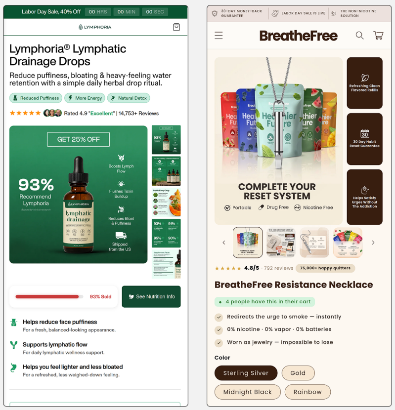
A standard e-commerce product page, but stacked with conversion levers layered around the buy box: countdown timers, “% sold” progress bars, benefit icons, social proof stats (“93% recommend this”), urgency badges. The lymphatic drops and smoking-cessation necklace examples both cram five or six distinct trust/urgency signals into the first screen alone.
Why it converts: This format doesn’t ask the visitor to do anything unfamiliar — it looks exactly like a product page, which is precisely what someone expects to land on after clicking a shopping ad. But unlike a default PDP, every element on the page is doing active conversion work rather than just displaying static information. Nothing here is a detour; it’s reinforcement layered onto a familiar shape.
Where it breaks: Overloading a PDP with every urgency trick simultaneously — timer plus scarcity bar plus live cart activity plus guarantee badge, all stacked in the first screen — tips from reassurance into visible pressure tactics fast, especially for a skeptical or repeat visitor who’s seen the same countdown reset three times before.
Build note: This is the format most directly served by conditional display logic on top of the existing WooCommerce product template — trust badges, urgency bars, and social proof widgets that can be toggled per product without touching the underlying page structure.
5. Listicles
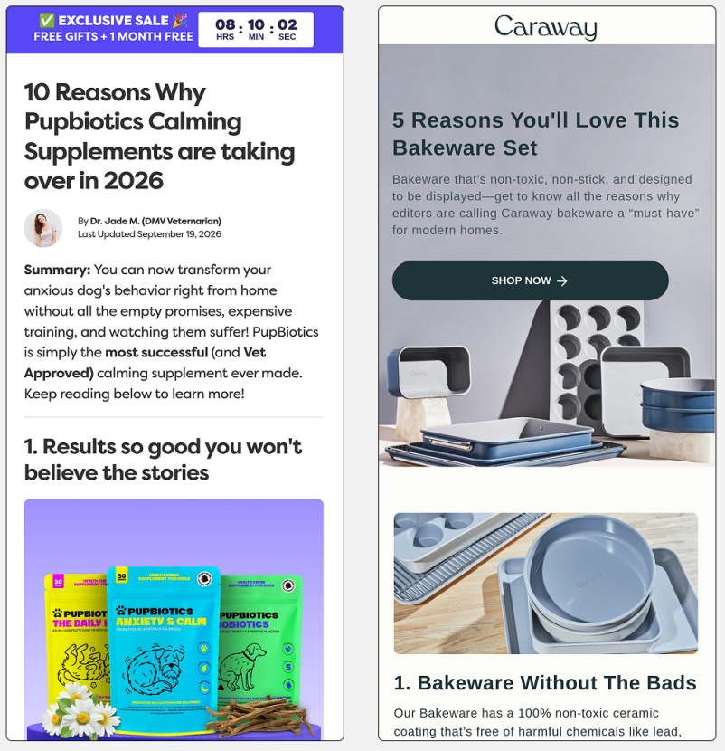
“10 Reasons Why X Is Taking Over in [year]” — numbered, scannable, written in a blog/editorial voice complete with an author byline and “last updated” date, with the product woven into each numbered point rather than pitched upfront in a banner. The calming-supplement and bakeware examples both use this exact shape.
Why it converts: Listicles read as informational content rather than promotional content, which lets them capture a colder, more research-mode visitor — someone actively Googling “best X for Y” rather than someone already primed to buy. The numbered-countdown structure also gives the reader a reason to keep scrolling out of pure curiosity about what’s next on the list, which increases both time-on-page and total exposure to the offer woven throughout.
Where it fits: Strong for top-of-funnel and SEO-adjacent traffic where the goal is education-then-conversion. Weak as a landing destination for someone who already clicked a direct “buy now” ad — the indirection reads as friction and annoys a visitor who arrived ready to purchase rather than to be persuaded.
6. Influencer / Authority Pages
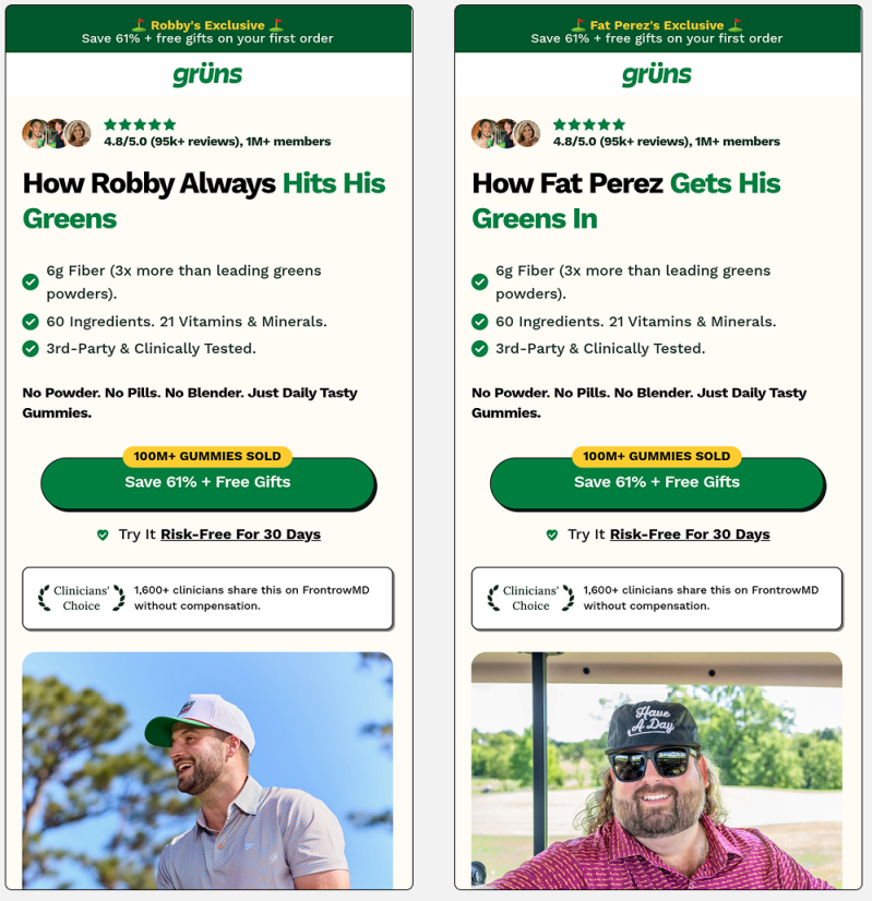
A landing page templated to swap in a different creator’s name, photo, and framing per audience segment — “How Robby Always Hits His Greens” versus “How Fat Perez Gets His Greens In” in the example shown, same core product and copy, different face and voice fronting it. This is structurally the same persona-targeting strategy discussed for ad creative earlier, just applied one layer deeper into the funnel.
Why it converts: Borrowed trust. The visitor already follows or recognizes the influencer, so the page inherits an existing relationship instead of needing to build credibility from a cold start. Templating the core page and swapping only the identity layer also lets a single build scale across many creator partnerships without rebuilding the page from scratch each time.
Where it fits: Requires either genuine influencer partnerships or, at minimum, properly licensed usage rights for the photos and names used — this is one format where cutting corners on rights creates real, fast legal exposure, not just a weak page.
7. Flip-to-Win / Gamified Pages
An interactive game layer — pick a gift box, flip a card — sits in front of the actual offer, with a reward revealed (randomized or pre-set) after interaction. Both examples shown use a 3×3 grid of hidden prizes the visitor taps through to reveal.
Why it converts: Gamification triggers the same anticipation-then-reveal loop as a scratch card or slot pull. It also extracts a “yes” micro-commitment — tapping to play — before the visitor has even seen what they’re being asked to buy, similar to the quiz funnel’s momentum effect but with a more visceral, game-like pull behind it.
Where it fits: Strong for email capture and discount-code delivery in casual, lower-consideration categories — food, beverage, lifestyle. Feels badly mismatched in high-consideration or medical-adjacent categories, where gamifying the offer undercuts exactly the credibility those products need to close the sale.
8. Bundle Builders
A page structured entirely around package and subscription tiers — 1-pack versus 3-pack versus 5-pack, subscribe-and-save versus one-time purchase, per-unit pricing and total savings shown side by side. The supplement examples both lean hard on subscription discounting to steer visitors toward the higher-commitment option.
Why it converts: Anchoring. Showing the 1-pack price next to the 3-pack per-unit price makes the bundle look like the obviously rational choice, and defaulting the toggle to “Subscribe & Save” nudges visitors toward recurring revenue without ever removing their freedom to choose otherwise. This format isn’t really about persuading someone to buy at all — that decision is already made — it’s about maximizing average order value and lifetime value from someone who’s already committed.
Where it fits: Needs a genuine consumption cadence to justify a subscription — something people actually run out of and repurchase on a cycle. Forcing a subscription model onto a one-time-use product just manufactures cancellation friction and refund requests down the line.
The pattern underneath all eight
None of these formats are really about design — they’re about matching page structure to where the visitor sits in their decision process. Cold, skeptical traffic needs advertorials or listicles that build trust before asking for anything. Warm, high-intent traffic wants DR pages and optimized PDPs that get out of the way. Existing fans convert through influencer pages. And once someone’s already decided to buy, bundle builders and gamification exist purely to grow what they buy and how often.
The mistake most stores make is picking one format and running it against every traffic source regardless of temperature. The page format should shift with the audience the same way ad creative shifts with persona — this is the same targeting principle from earlier, just applied one step further down the funnel, at the point where the money actually changes hands.
Leave a Reply