

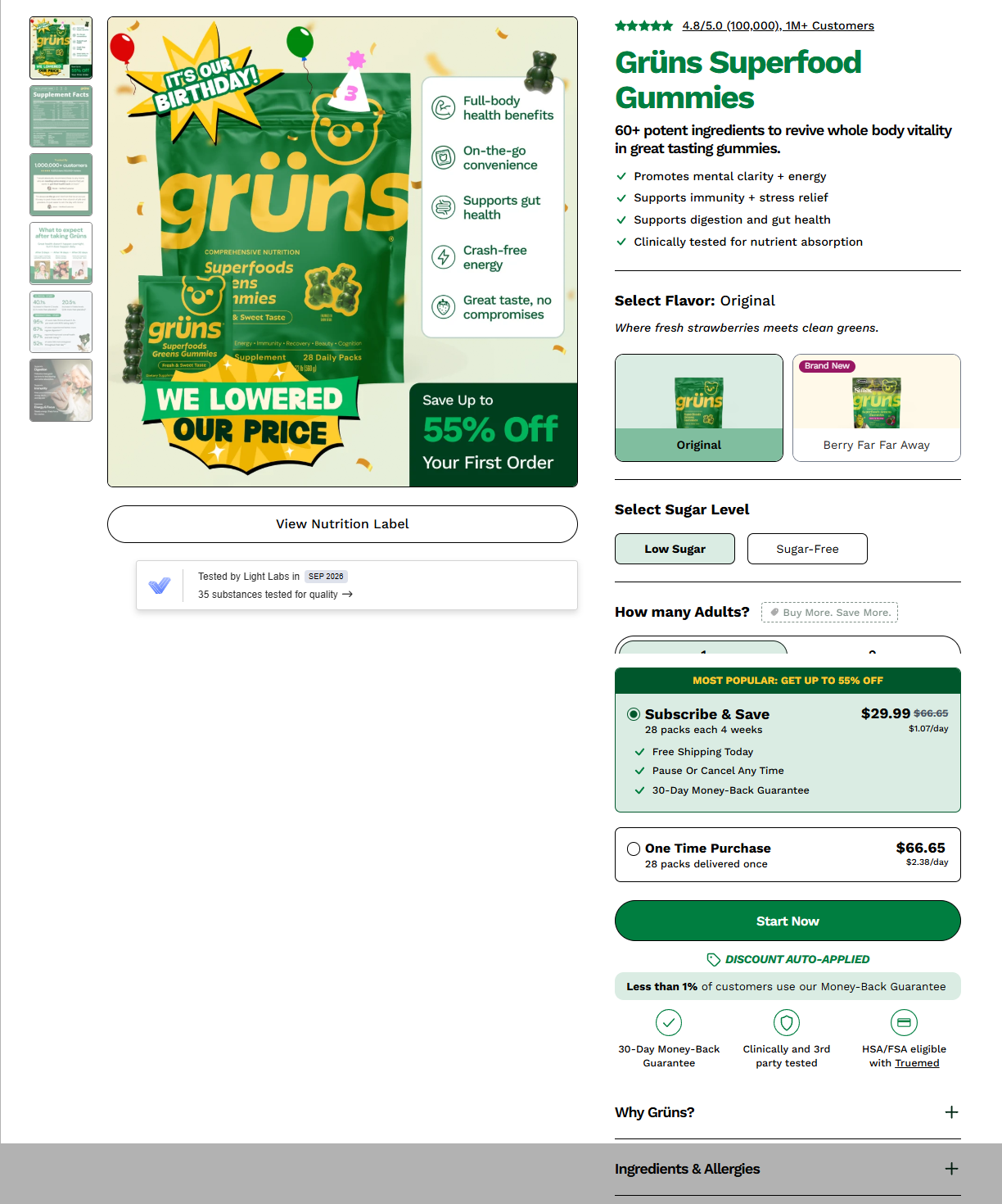
Discover Ten Actionable Updates To Make Your PDP Clearer, Faster, and CRO Focused.
Your product page is where the buying decision happens. Nearly every shopper goes through one before they commit, so small friction here costs real sales.
Baymard Institute’s 2026 benchmark of leading ecommerce sites found that 52% of desktop sites and 62% of mobile sites have “mediocre or worse” product page UX. Shoppers in their testing often walked away from products that suited them, just because the page made something hard.
Baymard’s research covers the best-known ecommerce sites, but the same mistakes show up on WooCommerce stores every day. Here are their 10 findings, with what each one means for your store.
1. Show sizes as buttons, not a dropdown
57% of sites still hide sizes in a dropdown. Shoppers then have to click just to learn that their size is sold out, which is frustrating.
In WooCommerce: Swap the default variation dropdowns for button swatches, using a variation swatches plugin or your theme’s built-in option. Grey out or strike through out-of-stock sizes so people can see availability at a glance.
2. Add an “in scale” image
About 42% of shoppers try to judge a product’s size from its photos, yet 37% of sites don’t give them anything to go on. A product next to a hand, a person or a familiar object tells the story faster than a spec table.
In WooCommerce: Add one in-scale shot to each product gallery, and put it in your photography checklist so it doesn’t get skipped. Start with your top 20 products by traffic.
3. Show wearable products on a human model
Clothes, bags, jewelry, watches and cosmetics are hard to judge from cut-out photos. 23% of sites miss this. People want to see how a jacket sits or how large a handbag really is.
In WooCommerce: Make sure every wearable product has at least one on-model image in the first few gallery slots. For makeup, show it applied, ideally across a range of skin tones.
4. Let guests save items
21% of surveyed shoppers rely on “save” features, but 89% of sites make them harder to use than they should be, often by forcing an account signup first. Many people refuse to hand over personal details just to bookmark something.
In WooCommerce: Choose a wishlist plugin with guest wishlists and turn off “login required.” Ask for an account after they’ve saved something, not before.
5. Display price per unit
81% of sites leave out price per unit. When a 13.5 oz bottle costs $17 and a 33.8 oz bottle costs $25, most people won’t do the math. Without a unit price, shoppers compare badly, and bulk buying (which raises your average order value) gets harder to sell.
In WooCommerce: There’s no native unit pricing, so use a plugin or a custom field with a filter on the price output. Show it per variation (for example “$0.74/oz”). Some regions require unit pricing by law, so check your local rules.
6. Estimate the total cost near the buy button
67% of sites don’t. Shipping, taxes and fees that only appear at checkout are a classic abandonment trigger, and shoppers comparing across stores won’t add items to their cart just to find out what you charge.
In WooCommerce: Show your lowest shipping cost, or an estimate with its conditions (“Free shipping over $50”), next to Add to Cart. For heavy or expensive items, add an expandable shipping calculator built on your shipping zones.
7. Put your return policy on the product page
44% of sites don’t. Baymard’s data shows 60% of shoppers look for return info on the product page, and 15% of surveyed US shoppers had abandoned an order in the last quarter because the return policy didn’t satisfy them. It matters most for apparel and expensive items.
In WooCommerce: Add a short summary with a link beside the buy box, or a dedicated “Returns” product tab. Write it in plain language and link it in your footer too.
8. Mention gifting early
78% of sites don’t, but some shoppers start thinking about gifts before they ever add to cart. If they can’t tell whether you support it, they may leave rather than hunt for the answer.
In WooCommerce: If gifting is a real part of your business, add a “Send as a gift” option or a short note covering gift messages, wrapping and whether prices are hidden on the packing slip. If few of your orders are gifts, this can wait.
9. Reply to negative reviews
89% of sites leave negative reviews unanswered. Plenty of shoppers read the bad reviews first, and a thoughtful reply signals that you care and are easy to reach.
In WooCommerce: Reply from the comments screen and style your responses so they stand apart from customer reviews (a “Store response” label works well). Set an email alert for 1 to 3 star reviews so nothing sits unanswered.
10. Let shoppers flip through customer photos
63% of sites make people open review after review to see customer images. Shoppers trust these photos because they feel more honest than studio shots.
In WooCommerce: Use a reviews plugin that supports photo uploads and a swipeable gallery across all review images, and test it on mobile.
Where to start
If you only have an afternoon, do these three first: add a returns link (#7), show a shipping estimate (#6) and switch sizes to buttons (#1). Then work on photography (#2 and #3) and review habits (#9), and leave the plugin-heavy items (#4, #5 and #10) for when you have development time.
Test everything on mobile first, since mobile product pages perform worst in Baymard’s benchmark, and check plugin compatibility with your theme before going live. Track add-to-cart rate and cart abandonment before and after each change so you know what’s working.
Source: Baymard Institute, “Product Page UX 2026: 10 Pitfalls and Best Practices” (updated March 2026). Percentages refer to the share of benchmarked sites with each issue.
Leave a Reply